I said way back in May that I’d be working my way through some of the great digital tools available on the Syngenta turf website Greencast tools area. Shining a light on some of the functionality we have sitting there for anyone to use (free) to make managing turf easier.
This time I’m shining the spot light on the Live turf diseases map. A tool which is based on weather forecast data to model predictions for a given issue.
You can see below the list of, mainly turf diseases, but also some general agronomy metrics (soil temperature, Poa seed heading risk) that are modelled:

The idea of these models is they take the huge data sets we have available at Syngenta, for example all the weather data used to power the agronomic decisions of farmers. And the model tells them what the trigger points are going to be, generally that’s temperature and rainfall for fungal diseases, and it gives a likelihood of pressure from that disease at that time.
You may see a wave of disease pressure pushing in land as a result of a storm, meaning you can get a treatment down preventatively before spray conditions go out the window.
Looking at Fusarium Patch risk, you can see the change in just a few days when I looked, most places medium risk with a few points of high risk at the top of Scotland:

Just two days later (toggling through the days in the top right) you can see those high risk points stretching much further south.

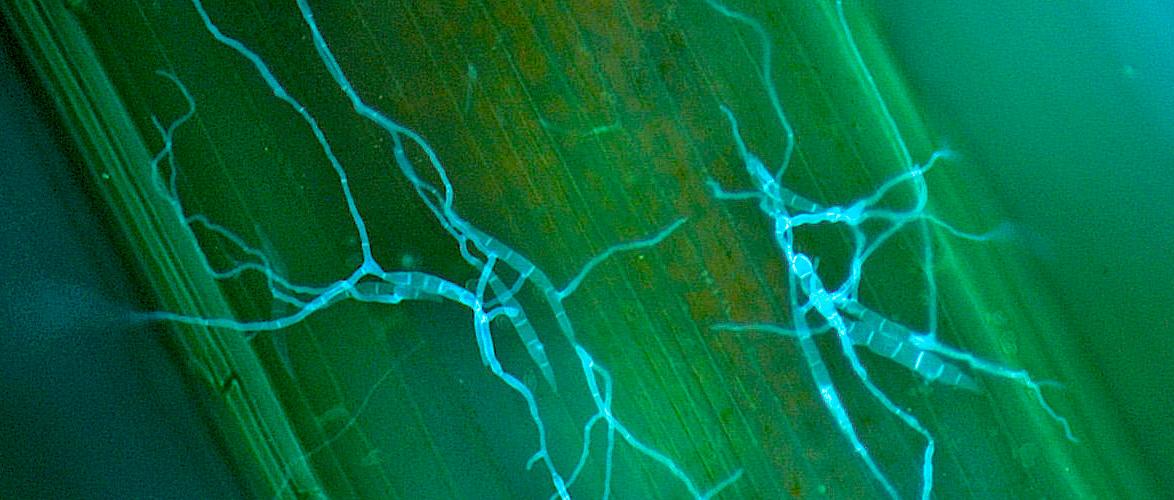
The models are not perfect, and with Microdochium its probably not telling you something you don’t already know (spoiler alert, UK sees pretty high Microdochium pressure all winter).
But these models look to get even more exciting in the future, if we can build in features that can let those out in the environment day to day (you & team) quickly and simply feed back on what your seeing.
The next level for most models is to test that big data with real data. It says you are in a high pressure period for Dollar spot, agree? No, then we can tweak the formula’s to make the models better. “Looks like were not seeing pressure at that temperature, we’ll move the threshold up half a degree for future“.
We know preventative applications of fungicides have a stronger affect in terms of disease control, using models like this one can support decision making so we can get application timings zoned in, to optimise the effects of the chemistry we have available.