
We’ve recently launched our GDD tool – take a look … and a sure sign of engagement is questions and I’ve had a few. In this blog I’m going to talk about why some of your GDD figures look different to the ones you’ve generated on-line and why it probably doesn’t matter anyway.
A traditional GDD model will take the highest temperature and the lowest temperature in the day and work out the average.
It’s been done this way as traditionally the weather data was manually added and the high and low was generally all you had access to or time to enter.
The new GDD tool uses high levels of weather data behind the scenes to work out the average temperature for each hour then bundle all that information together to help create a GDD figure.

Why does this work out differently?
When we use the simple High and Low figures we make the assumption that the day is split evenly between the two figures.
We know this simply isn’t true. The earlier parts of the year we tend to see longer periods of cool temperatures whilst the Autumn tends to present longer periods of warmer temperatures.
How does this manifest itself into the figures?
Against the traditional calculation I’d generally I’d expect to see it taking longer to reach GDD targets in the spring and faster in the Autumn. It will however vary on weather which is why it should give us a better representation of whats going on.
In reality it will not make a big difference, you may see one or two real days difference, which isn’t going to change your management plans much at all.
The biggest differences
The biggest and most obvious difference I’ve had reported to me though is along the coast lines. When you begin to think about the climate in these regions it does make sense.

Here’s a great MetOffice piece on Microclimates ...
Coastal climates are heavily influenced by the sea rather than the land. Coastlines are usually milder than inland during the winter and cooler in the summer. Short-term variations in temperature and weather can be considerable. It makes sense that monitoring the weather data much closer will churn out some different figures.
When you study the difference in the data though most of the differences are due to different high and low figures rather than how the data is processed.
Why we see the differences is down to how that data has been generated. The figures used by our GDD tool are generated by data models based on multiple inputs. But they cannot adjust to individual micro climates. The golf courses own data source could be a nearby weather station, there own weather station, an app or simply a thermometer. Whether its a better data source is dependent on a number of factors.
How different is it?
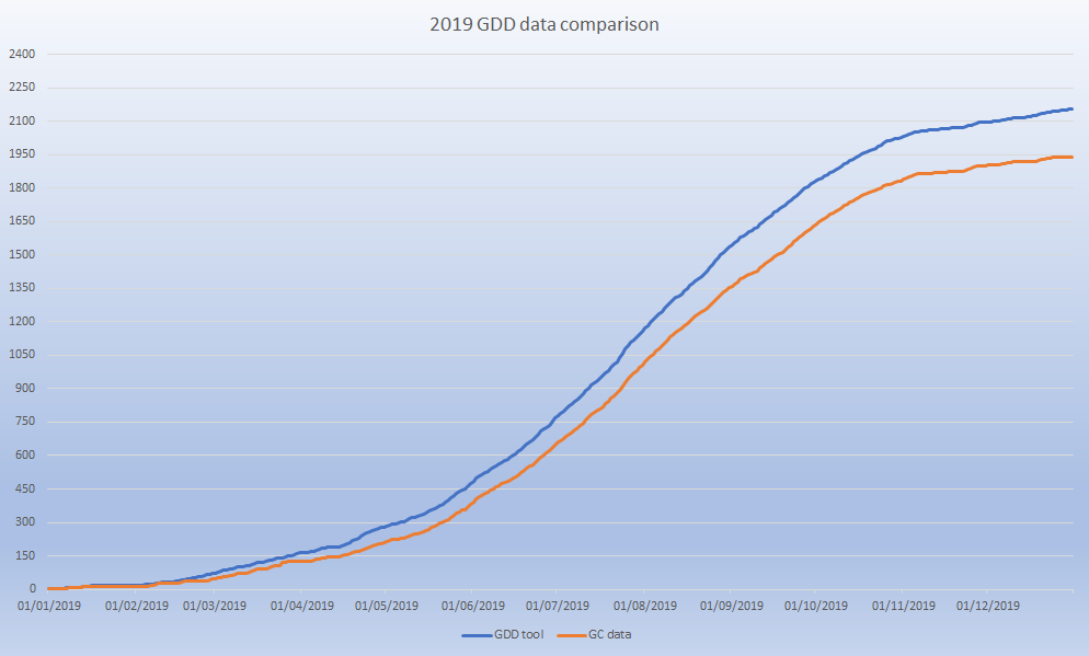
Heres all of 2019 – Blue is the Syngenta GDD tool data v the orange golf courses data. Around a 10% difference.

If you were to apply 150 GDD application windows to these two models (Mid April to end of October) and you stuck to that regime perfectly you’d slowly see the windows get out of sync. But even in this extreme version it only makes a difference of one application.

In reality application dates don’t change and along the coast line I regularly see the above pattern. On a 150 GDD application window you see at the most two days difference and on the coast line we show GDD ticking over quicker in the Spring and longer in the Autumn.
Conclusion
Our weather data isn’t perfect but it’s pretty good, consistent with no data gaps and unless you have a well calibrated weather station it’s likely to be as good if not better than your data source.
The additional processing of the data should give more accurate interpretation of the figures using our GDD tool and be alot easier for you.
However if you have your own weather station, you’re happy to keep entering the data yourself and you manage your GDD related program so tight that a couple of days makes a difference – then it’s probaly best to stick with your current system.
If not – sign up and give it a go …
More of my articles about Growing Degree Days (GDD) here.