
Historic Disease Information
This is one of those tools that’s going to be very useful in the right situation. Like a rake, it’s the perfect tool for certain jobs but you wouldn’t want to dig a hole with one.
Tip 1:
Who’s it useful for?
For anyone who’s recently moved clubs, especially to a different geographical area the outputs of this tool can help inform you of the risk of turf disease outbreaks based on historical weather information.
Or if you’ve been at a club for a while and you’ve been struck by a turf disease that you weren’t expecting, or haven’t seen before, it can be good to look at the model to understand if its something driven by climate/environment or change in practice.
Tip 2:
These outputs are all based on modelling, its no substitute for experience. SO, if you’ve been course manager somewhere for 10+ years and you take a few notes about when you see signs of different diseases across the year. Don’t throw those notes in the recycling bin and praise that the ‘digital age’ has arrived! Those experiences at a specific site are invaluable and can’t be matched by any digital modelling yet (perhaps if you have an onsite weather station which logs all data you can come close).
If you are starting somewhere new, and it could be just 10 miles down the road, with a surprisingly different microclimate (especially in coastal areas) then this tool is great to have a look back at the historic disease risks for your new site.
Tip 3:
Make sure you set the « Start date » back a few years (generally I’ve been going back to 2018) so you can capture a few different years worth of data. It’s surprising how different disease pressures can be year on year.
Using the tool:
As you can see below, the risk is up the side of the graph, the higher the number the more risk of disease outbreak.
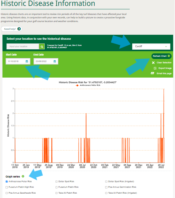
Input your course location, date range, select the disease and click refresh chart.
Hover the mouse over a line to see the exact date it happened. You can select multiple diseases at once but I’d suggest viewing each separately as the graph gets pretty swamped (especially if you select fusarium).
Things to bare in mind:
- Seeing high risk of a disease, let’s say Anthracnose in mid August 2021 does not mean you would have had it, if your ITM program is on point, and you had controls in place we would not expect to see disease outbreak, its just the risk of outbreak is higher.
- Its all based on weather modelling so if you are further from a weather station or have a strange microclimate its not going to be perfect, but it should still give an accurate enough picture.
- Not all diseases are included in the tool.
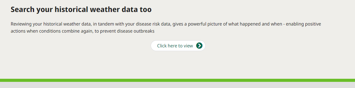
- If you find something interesting, for example a high risk of a disease in a given year you can scroll to the bottom of the page and access historical weather information to see what was going on at that point to fire up disease. The tool gets really powerful when you do that, as you can use that information to predict future hotspots in the calendar for that disease. Like a wet and cold summer (can we even remember one of those?)
Hopefully it’s a useful tool, and may even be valuable for supporting investments or purchases. If the members or greens committee want to see something tangible to support what you’ve been saying.
